 |
| The unadorned silhouette of the Royal Enfield Bullet Classic 500. |
I'm not an artist or designer. But, obviously, artists and designers have long been interested in the shape of women. They're generally creating art or objects they want people to look at; and they know people of both sexes like looking at women.
All I'm really trying for here is to make the point that this particular Royal-Enfield sort of motorcycle is a visual winner because it has this particular, classically popular visual appeal.
I am not insinuating it's anyone's fault that these similarities exist between humans and objects. It is a problem if it is exploitative. As a tribute to nature's original, though, it has its place.
And I couldn't help noticing. See if you agree.
Now, at first thought, it might seem that motorcycles, designed to fit between a rider's legs, might be more in line with typical male equipment. That's a crude simplification, and may be true of the motorcycles dubbed "choppers."
I'm looking at the more subtle visual cues in the standard motorcycle of the 20th Century, as represented by the Royal Enfield.
 |
| The so-called "naked" motorcycle has everything you need, but nothing more. |
Think back, before you owned a motorcycle. As a child, could you have drawn a picture of an ordinary motorcycle? I would have had trouble with this, as I didn't understand what all the "stuff" in view on a naked motorcycle was for, or where in the picture it should all go.
But this much I would have gotten correct, even as a kid: the headlight, instruments, tank, fenders, handlebars, wheels and seat. These are the most noticeable elements of the motorcycle. The rest of the gear is under there somewhere, doesn't matter much where.
 |
| The Royal Enfield seems to turn its face toward you. |
A motorcycle headlamp that is not mounted in a fairing moves with the front wheel in the direction the motorcycle will go. The motorcycle headlight turns toward where it is going, as does the human face.
 |
| The Royal Enfield nacelle suggests a head, with eyes and "brains" (instruments). |
Next, handlebars. These aren't usually as attractive as the human arms they represent, but they clearly mirror the shape and functionality of human arms. Notice that the handlebars end, like arms, in controls and levers that serve human hands as do fingers.
 |
| It's easy to see the human form in this view of a Royal Enfield motorcycle. |
That visual something was the similarity to rounded breasts.
I know you see this, so I don't even need to go on to point out that the saddle tank actually has cleavage (out of sight on the bottom, to accommodate the top bar of the frame) and, sometimes at least, a nipple on each side. (For simplicity the Royal Enfield Bullet only gives you one fuel tap but some motorcycles use two.)
 |
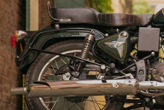
| The Royal Enfield solo seat mirrors the part of the human anatomy it serves. |
Finally we come to the fenders and wheels. Things are now really subtle, as wheels can't take any other shape, and fenders are sometimes reduced to being called "mudguards." No part of the human body performs the unseemly function of "mudguard." What an inelegant term for what are in fact the pleasing shapes of the Royal Enfield Bullet fenders.
Don't see it? Well, compare the rounded yet slim shape of the Royal Enfield Classic 500 rear fender to the fuller, yet angular design used on the B5 Bullet. The appearance of the Classic 500 is obviously better, although the B5 is probably a better mudguard.
 |
| The Bullet 500 mudguard will work to catch mud. But it is certainly less pleasing to the eye. |
After all, how did the "standard motorcycle" get to become the "standard" anyhow? Because we most all agree it's the right shape.
You would be foolish to attempt to improve on the shape of a woman.


Oh, David... you're walking where the ice is thin in a post like this one. Good luck with comments and I hope you had a great Thanksgiving!
ReplyDeleteThank you and I hope your Thanksgiving was happy.
DeleteYou put an interesting spin on what inspires the styling of a motorcycle. Whenever I discuss styling differences between classic Japanese and British motorcycles, I put it more simply: British styling is "organic" with flowing lines and rounded corners. Where if we look at the Japanese counterparts, they had a more angular, "appliance" like look. The Japanese had the function figured out pretty well, but were lagging in the form department, IMHO.
ReplyDeleteRegarding Enfields in particular, I always find the timing covers of the pre Series II Interceptors and lesser twins more visually appealing, because they are more curvaceous. Does that make me a motorcycle pervert ?? Only my therapist knows for sure! LOL
It's been scientifically proven that the attractiveness of the female shape overall is decided by the 'hip to waist ratio'. Thinner upper torso, narrow waist, clean curvature of the hips is generally optimal and isn't necessarily determined by weight. Having become aware of this I've (cheerfully) studied it 'in the wild' and found it to be true. If you apply this thinking to motorcycle design I believe you'll see it is applicable to your discussion.
ReplyDelete