 |
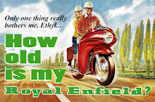
| Royal Enfield Motorcycles, the new banner. |
The banner was my Christmas gift from daughter Erin, who gave the designer this guidance:
"My dad has this blog that he really pours a lot of time into. He's a professional newspaper journalist who now blogs — pretty much every single day — about his favorite motorcycle, Royal Enfields.
"Don't worry, it's not some macho Harley Davidson type thing. It's a vintage British motorcycle that appeals to more sophisticated motorcycle fans — or at least the ones willing to spend more time fixing and understanding the temperamental machine than riding around showing off."
I love the result, and asked designer Ariel Tyndell of Velocity Vectors where she got her inspiration. She responded:
 |
| Ariel Tyndell of Velocity Vectors. |
Ariel's website describes her as "a junior at Middle Tennessee State University working on my BFA in Graphic Design. I started my logo design business in January of 2011 with a shop on Etsy.
"Since then, business has been rapidly expanding. This is currently my only job and I feel blessed to be able to do something that I love every day."
Velocity Vectors does website design, banners, logos and branding.


Love the fresh banner design. Seems as though the designer should have worked an Indian flag into it as well. In fact, in not so subtle ways, it seems as if Bullet enthusiasts try to downplay the origins of their bikes by emphasizing their British heritage with Union Jack stickers and the like. Where's the shame in riding a motorcycle built in India? But I guess that's a topic for another column.
ReplyDeleteNice new logo. And how fitting is it that the designer's name is Ariel??
ReplyDelete"Chuch D said... Seems as though the designer should have worked an Indian flag into it as well. ...."
ReplyDeleteAbsolutely! without the Indian unit, RE would just have been just another extinct British marque. In fact the Indian connection which testifies the tough nature of the machine should be included here. & what is this 'Vintage' thing got to do with this blog? A'int we here discussing anything & everything Enfield. No wonder the design is as ill fitting as the name.
cheers, Crankie.
Well...I like it!
ReplyDeleteI like the new banner! I also noticed that the latest editon (Jan/Feb 2012) of Motorcycle Classics, has an awesome article on the Bullet. The author refrences this website as a great refrence for anything Royal Enfield. Congratulations on a wonderful site, David!
ReplyDeleteNot bad Blasco ,not bad at all .
ReplyDeleteI think the filly has done a fine job ,even managed to get the flag the right way up- don't yer know .
You should give some credit to our Indian chums though - eh what ? The poor blighters must be feeling quite left out ,having made the ruddy bikes ,haar haaaaar haaaaaaaaaar !
Oh by the way ,"Happy New Year".
Tally Ho !
Bunty .
I love it!
ReplyDelete